

It turns out that some of the most well-known logos in the world were designed to indicate something much more than simple beauty. In fact, […]
It turns out that some of the most well-known logos in the world were designed to indicate something much more than simple beauty. In fact, it seems that in some cases, every line, curve and color has meaning behind it.
Here are 10 famous logos with hidden meanings that we never noticed before. Fascinating!
1. Hyundai

Many people are inclined to think that the logo of the South Korean conglomerate Hyundai is simply the first letter of its name. But actually, the letter ’Н’ symbolises two people (a client and a representative of the company) shaking hands.
2. Apple
Rob Yanov, the designer who created with the world-famous Apple company logo, has explained how he came up with the idea: ’I bought a whole bag of apples, placed them in a bowl, and spent time drawing them for a week, trying to break the image down into something simple. Taking a bite out of an apple was part of the experiment, and completely by coincidence I realised that ’bite’ sounded exactly the same as the computer term ’byte’.
3. Google
The Google logo has four primary colors in a row then it’s broken by a secondary color. This was entirely intentional. Google wanted to show that they don’t play by the rules and are also playful without making the symbol bulky. To do that, they just used simple letters and colors.
4. Amazon

At first glance, Amazon’s logo appears to be nothing special. But it was designed with the philosophy of the company in mind. The orange arrow is similar to a smile, as the company wants its customers to be satisfied. The arrow is also stretched between the letters ’A’ and ’Z’, in a hint that the company sells absolutely every product imaginable (’from A to Z’).
5. Coca-Cola
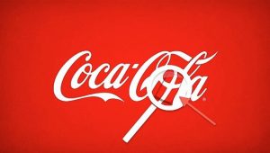
In the world-famous logo of the Coca-Cola Company, in the space between the letters ’O’ and ’L’, one can clearly see the Danish flag. Purely a coincidence, the company has nevertheless used this as part of it’s marketing campaigns in the Scandinavian country.
6. Pepsi
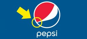
It’s hard to believe, but Pepsi paid over a million dollars to create this special logo with its secret meanings. The new special design hints at mysterious and secretive themes, such as the Earth’s magnetic field, Feng shui, Pythagoras, geodynamics, the theory of relativity, and the golden ratio. The designer has explained that this logo also makes reference to the Mona Lisa, the Parthenon, and even René Descartes. The red, white and blue colors have always represented the American flag.
7. BMW
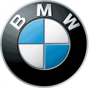
BMW has a history in aviation and its logo stays true to its roots. The blue and white represent a propeller in motion with the sky peeking through. In fact, BMW had a role in World War II as a creator of aircraft engines for the German military.
8. Mercedes-Benz
The Mercedes-Benz logo is the most confident of all. The tri-star represents the company’s dominance in quality and style over all things land, sea and air.
9. Formula 1
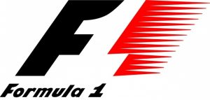
If you look carefully at the white space between the letter ’F’ and the red stripes in the Formula 1 logo, you can see the number 1. The red stripes of the logo are also meant to be a graphical representation of the speed achieved by Formula 1 cars.
10. IBM
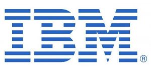
IBM’s logo has a hidden message for the whole world. The white lines passing through give the appearance of the equal sign in the lower right corner, representing equality.